Līmenī
A three-language site for a Rīga industrial-flooring contractor, built to turn architects and contractors into qualified quote requests.
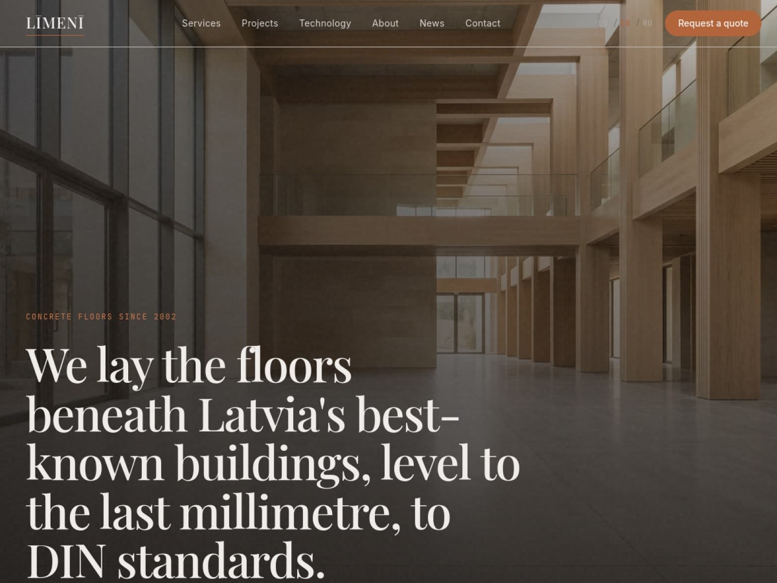
Līmenī had years of flawless industrial floors and almost nothing to show for it online. Architects and contractors who went looking found nothing that matched the quality of the actual work, so every quote still had to start with a phone call. Good work stayed invisible to the exact people choosing who lays the floor.
Specifiers judge a flooring contractor on proof, so the site leads with it and funnels to one action: request a quote. The form is built for the trade, it asks for project type, area in square metres, location and timeline, so an enquiry arrives as a scoped brief the team can price and recommend a system for, not a vague 'contact us'. Everything before it earns the click: a wall of blue-chip contractor logos, landmark projects like ORIGO and the VEF Culture Palace, DIN strength classes and equipment detail that speak the specifier's language, and a four-step 'how it works' that sets expectations. Click-to-call is wired site-wide for the ones who would rather talk. Years of flawless floors that were invisible online now pull in the exact architects and contractors choosing who lays the floor.
Why it looks the way it does
The thinking behind the design: what we chose, what we changed, and why.
Concrete is the palette
The page ground is a light concrete grey, hairline rules sit like formwork joints and the ink is a warm near-black. The material the company perfects is the material the site is built from.
One orange, spent carefully
The brand clay orange appears only on actions and key accents, with a deeper tone for hover. Against calm grey floors it lands with full force precisely because it is rationed.
Photography does the selling
Architects and contractors judge floors with their eyes, so the layout is editorial and photography-led: big, calm images of finished work, captions instead of claims. The copy supports; the floors convince.
Three languages, one system
Latvian, Russian and English share one grid, one type system built on Open Sans under the LEMON MILK logotype, and one quote-request flow. Specifiers get the same confident site in whichever language they arrive.
Hover to take a closer look.

Want one for your business?
Send your site for a free audit or book a call. We reply within 1 business day.